
Selected work / Packaging & label design
BEYOND THE BOX.
BRAND IN HAND.
Packaging that brings a brand into the physical world. A selection of my packaging and label design work, from SureFire product boxes to wellness packaging and beverage labels.
Explore the work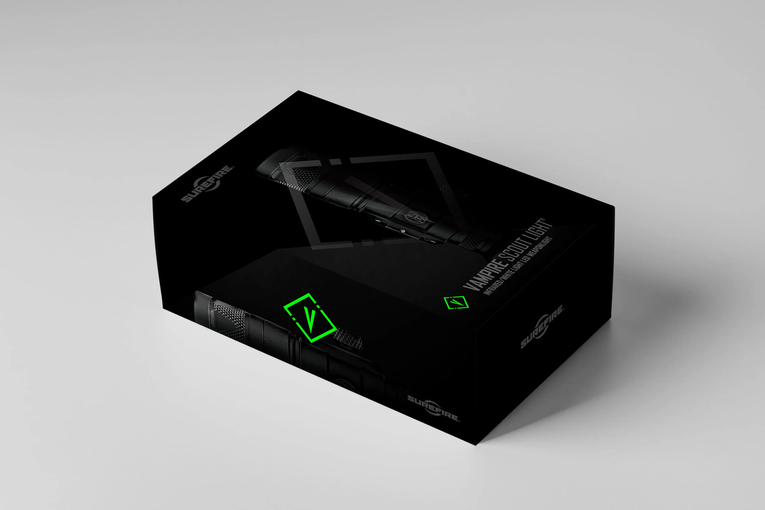
Discipline
Packaging & label design
Featured work
SureFire / Raw Elements / Emergen-C
Formats
Product boxes / Labels / Flat artwork
The work
THE PRODUCT.
THE PACKAGE.
ONE IDENTITY.
A package is a physical expression of a brand. Color, typography, imagery, and the placement of information work together to introduce the product and give it a distinct identity.
This collection spans product boxes, labels, presentation mockups, and flat packaging artwork. Each project shows a different approach to translating a brand’s visual language onto a physical format.
Explore the finished presentations alongside the artwork behind them. Select an image to view the details at full size.
BRAND EXPRESSION
Distinct visual treatments for different products, from the dark, technical character of SureFire to the bright color and product cues of wellness packaging.
DESIGN IN DIMENSION
Artwork considered across box panels, wraps, and labels, with mockups showing how individual design elements come together as a complete package.
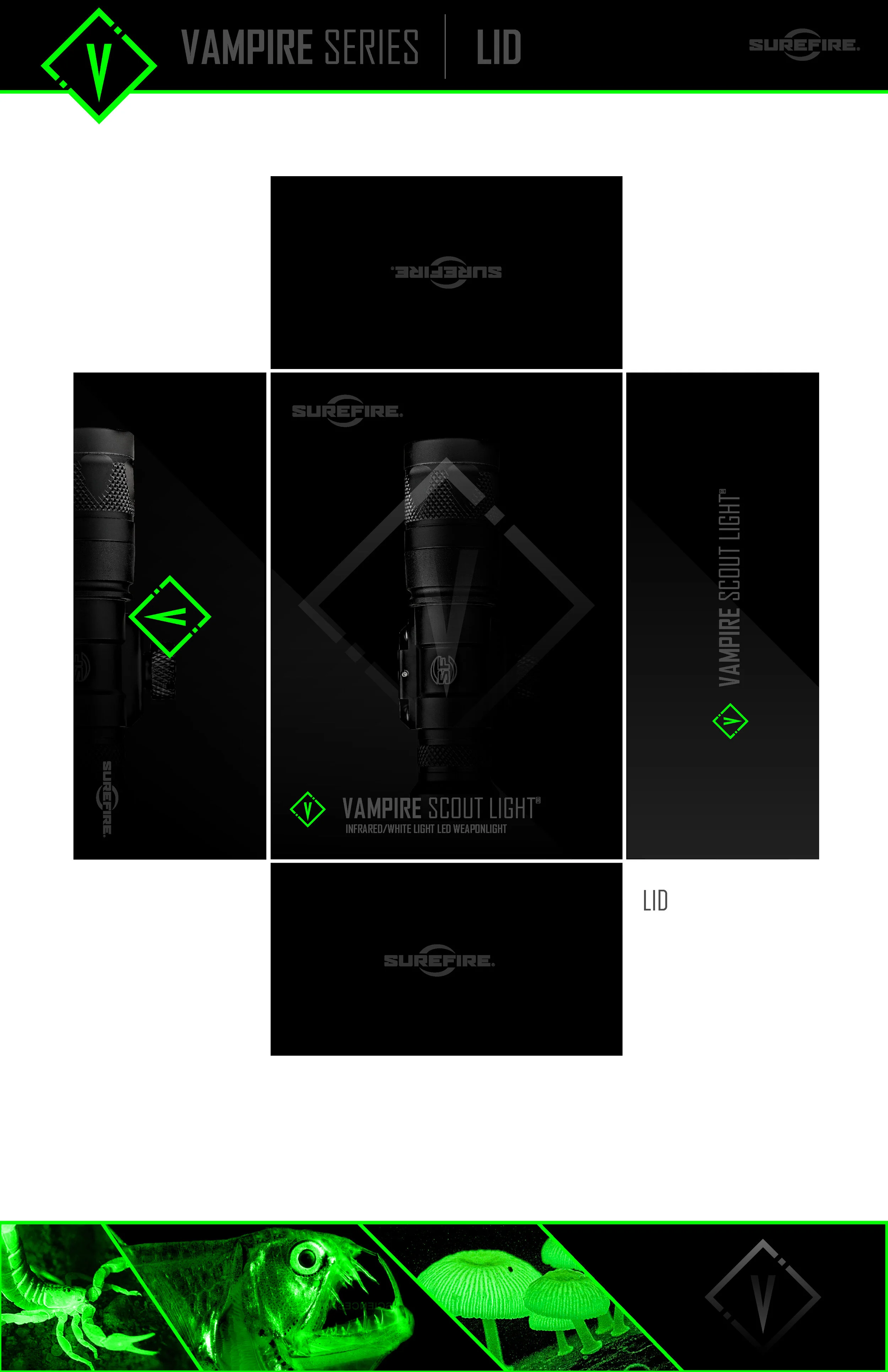
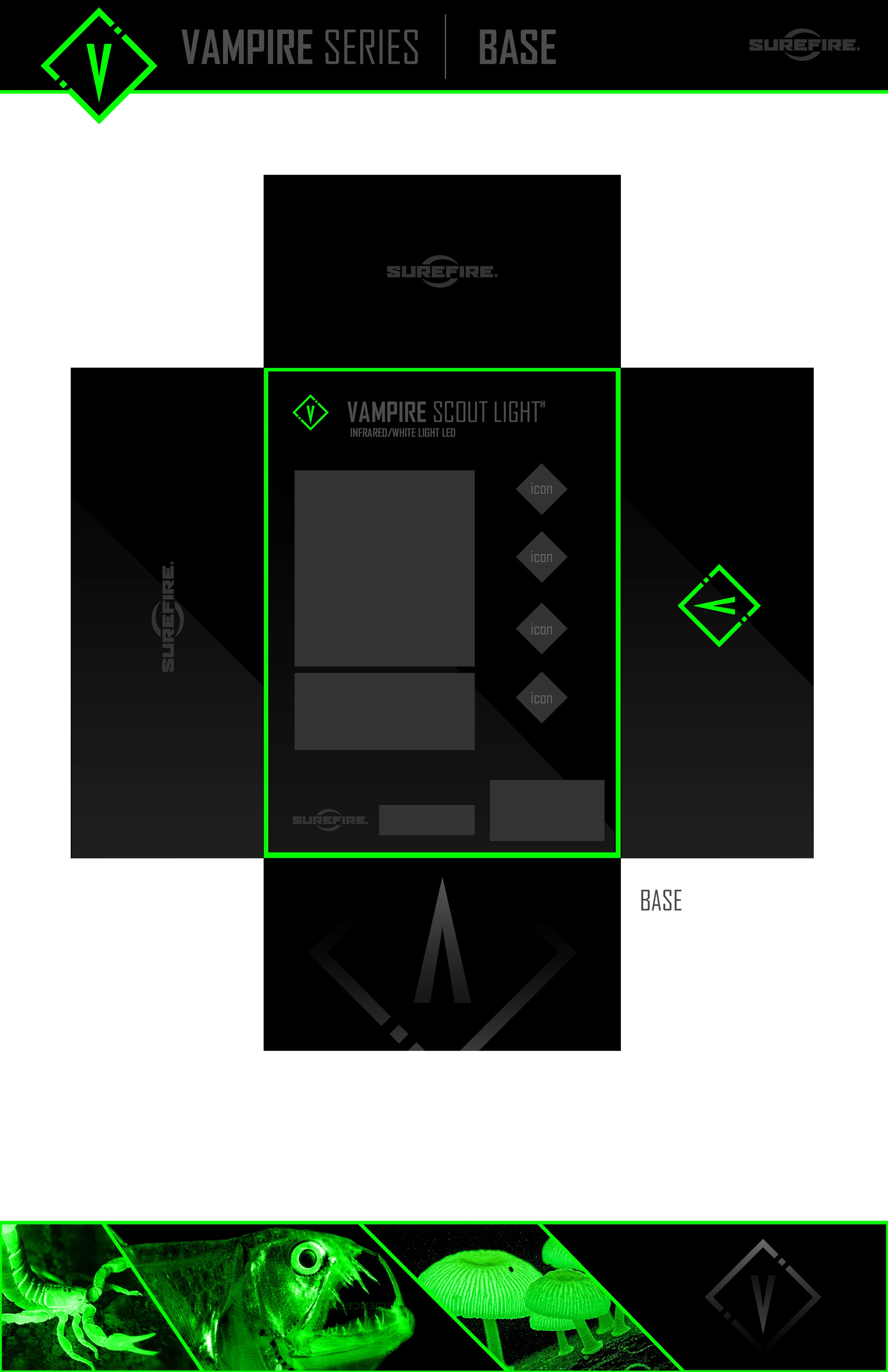
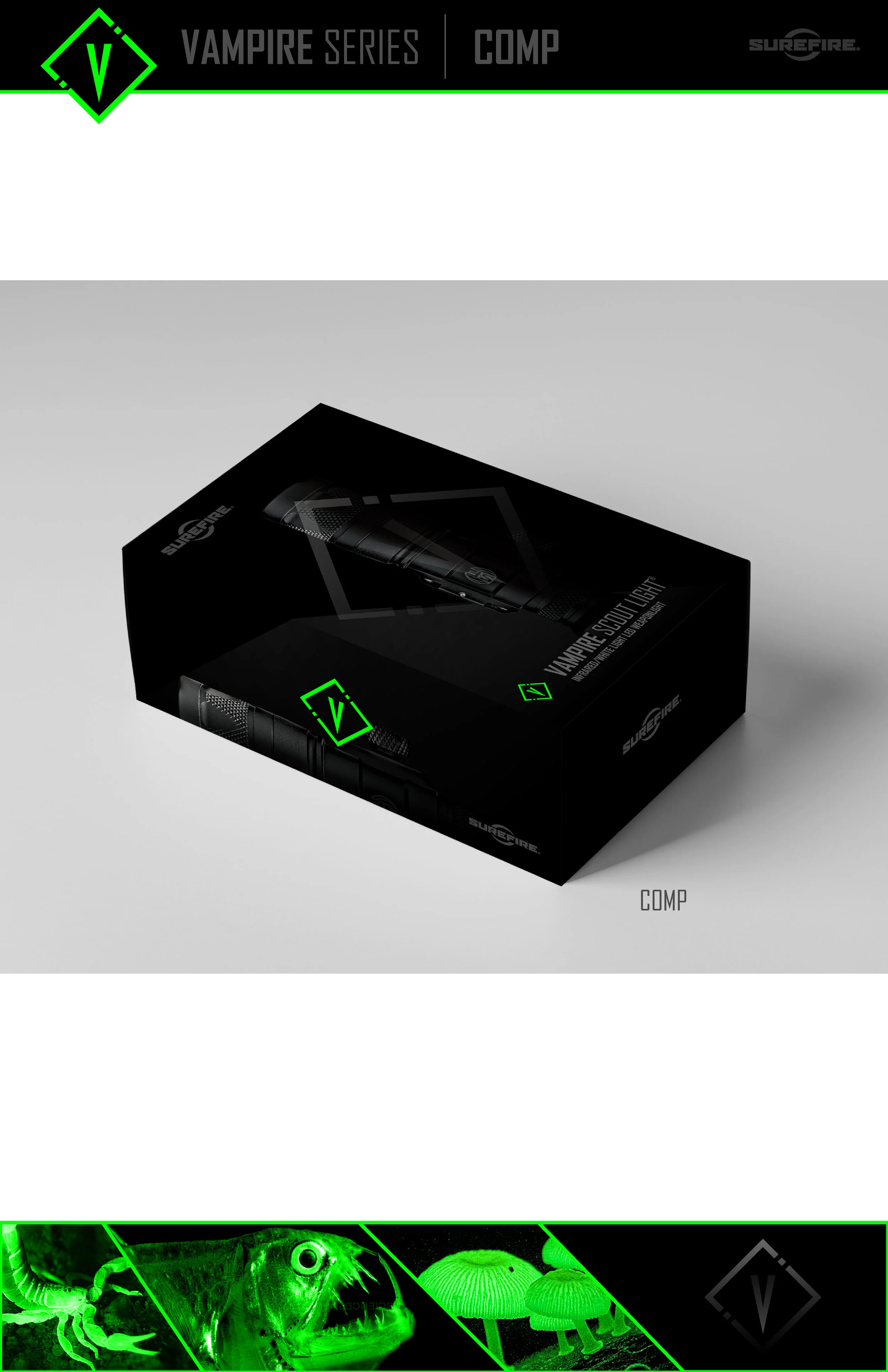
01 / SureFire Vampire
A DARK PALETTE.
A DISTINCT IDENTITY.
Black packaging, green accents, and illustrated imagery give the Vampire presentation a recognizable visual character.

02 / SureFire 2211 Luminox
PRODUCT PRECISION.
PACKAGE PRESENCE.
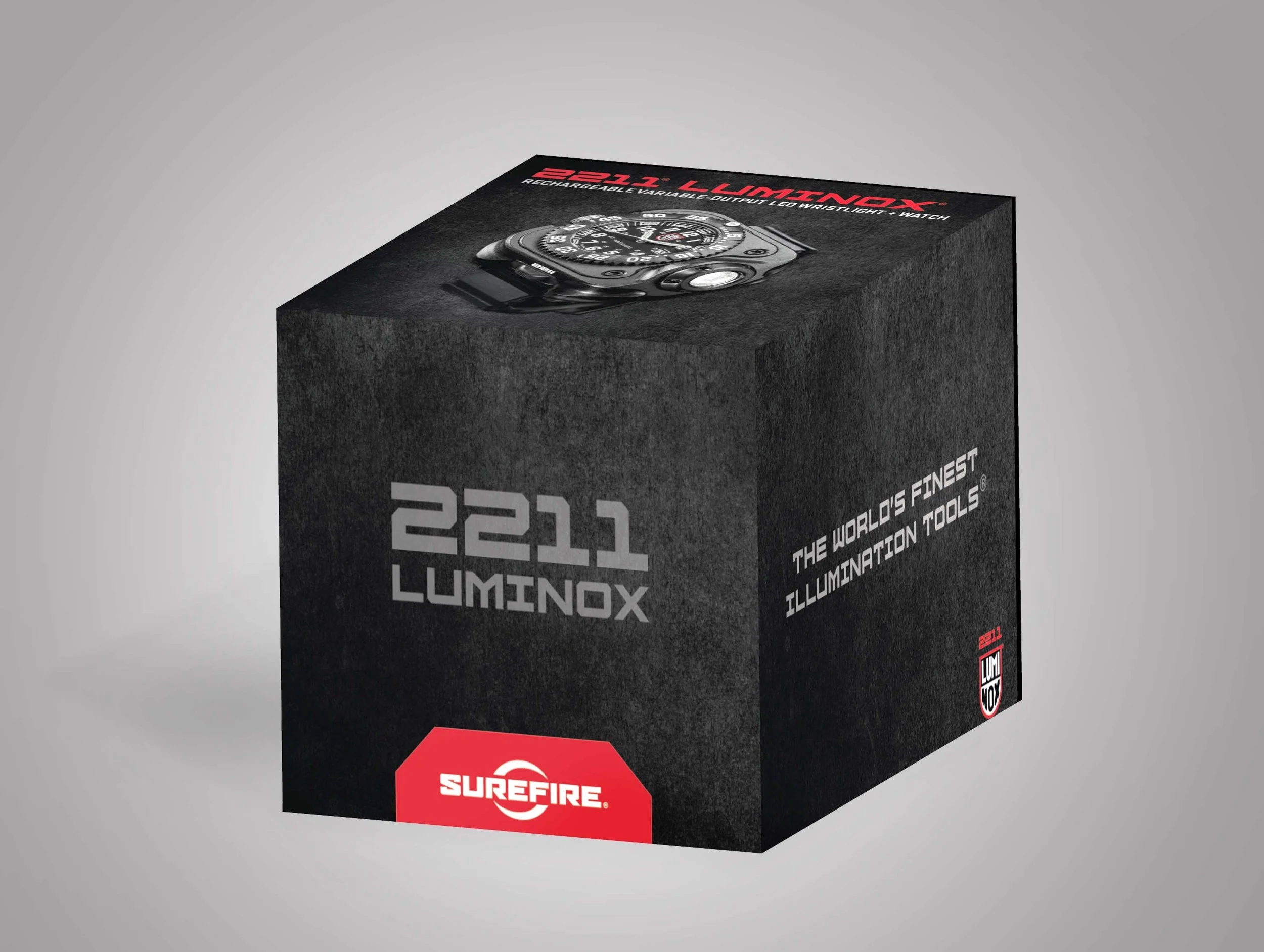
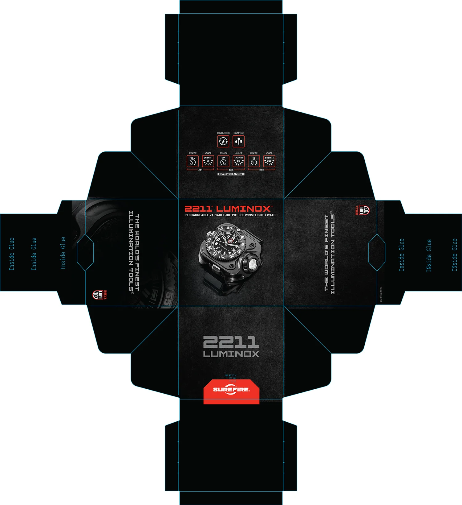
Product imagery, a dark palette, and the SureFire identity carry through the 2211 Luminox box presentation and panel artwork.


03 / Raw Elements
ONE FAMILY.
FOUR EXPRESSIONS.
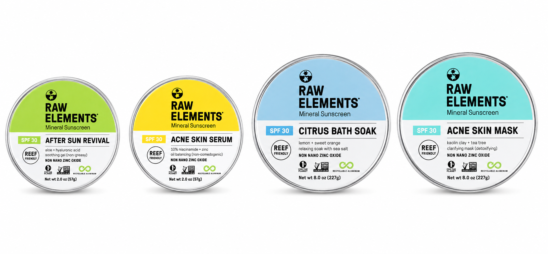
A consistent circular label format brings the collection together, while individual colors and product names distinguish each variant.
04 / Emergen-C
BRIGHT COLOR.
CLEAR PRODUCT CUES.
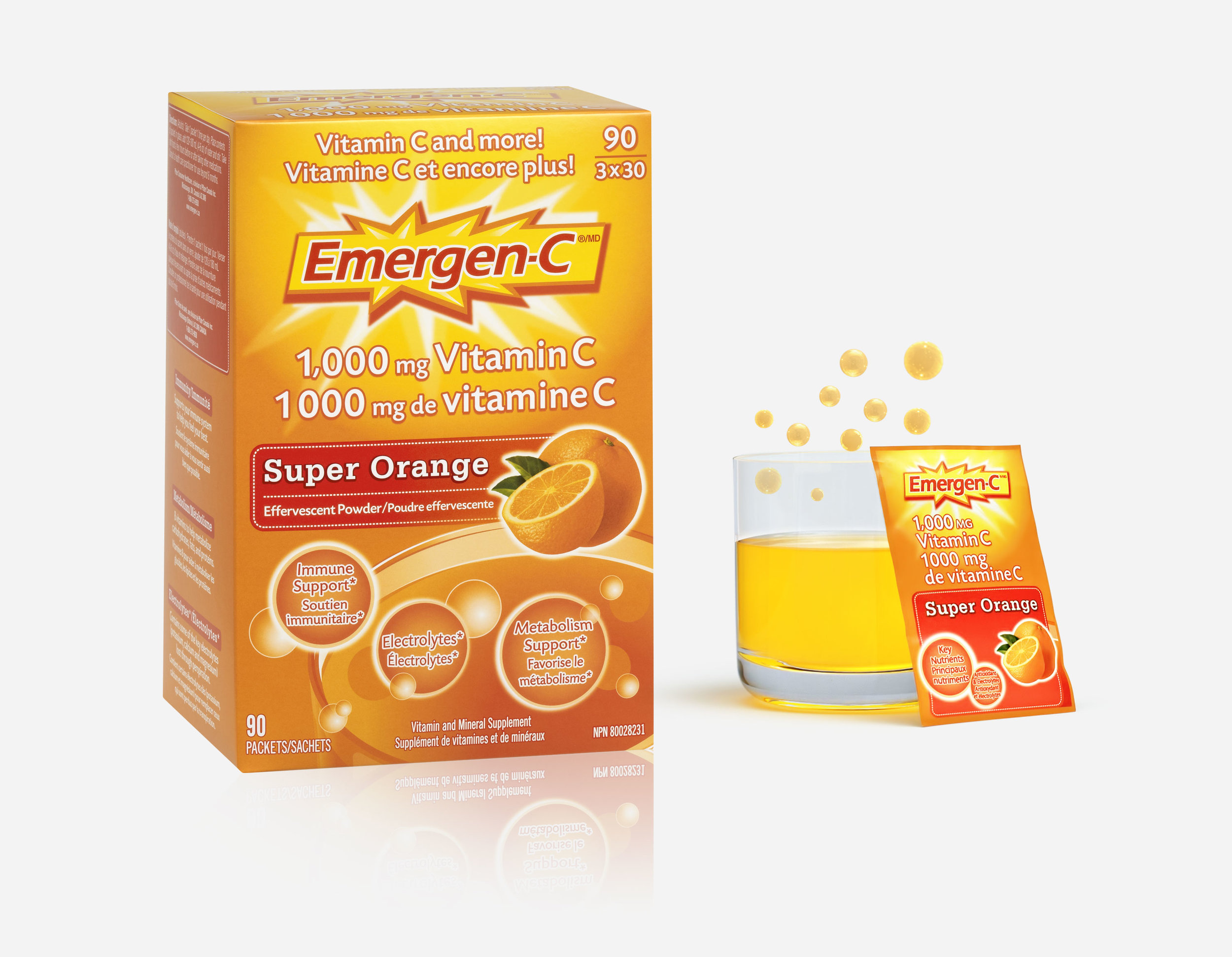
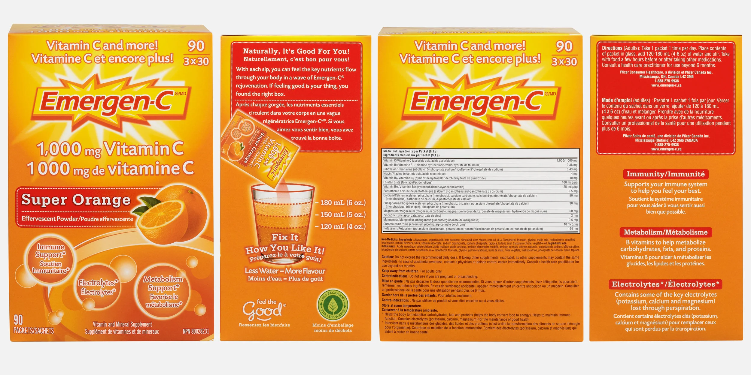
Carton and packet artwork pairs the Emergen-C identity with flavor imagery and prominent product information.


05 / SureFire label design
A DIFFERENT FORMAT.
THE SAME BRAND ENERGY.
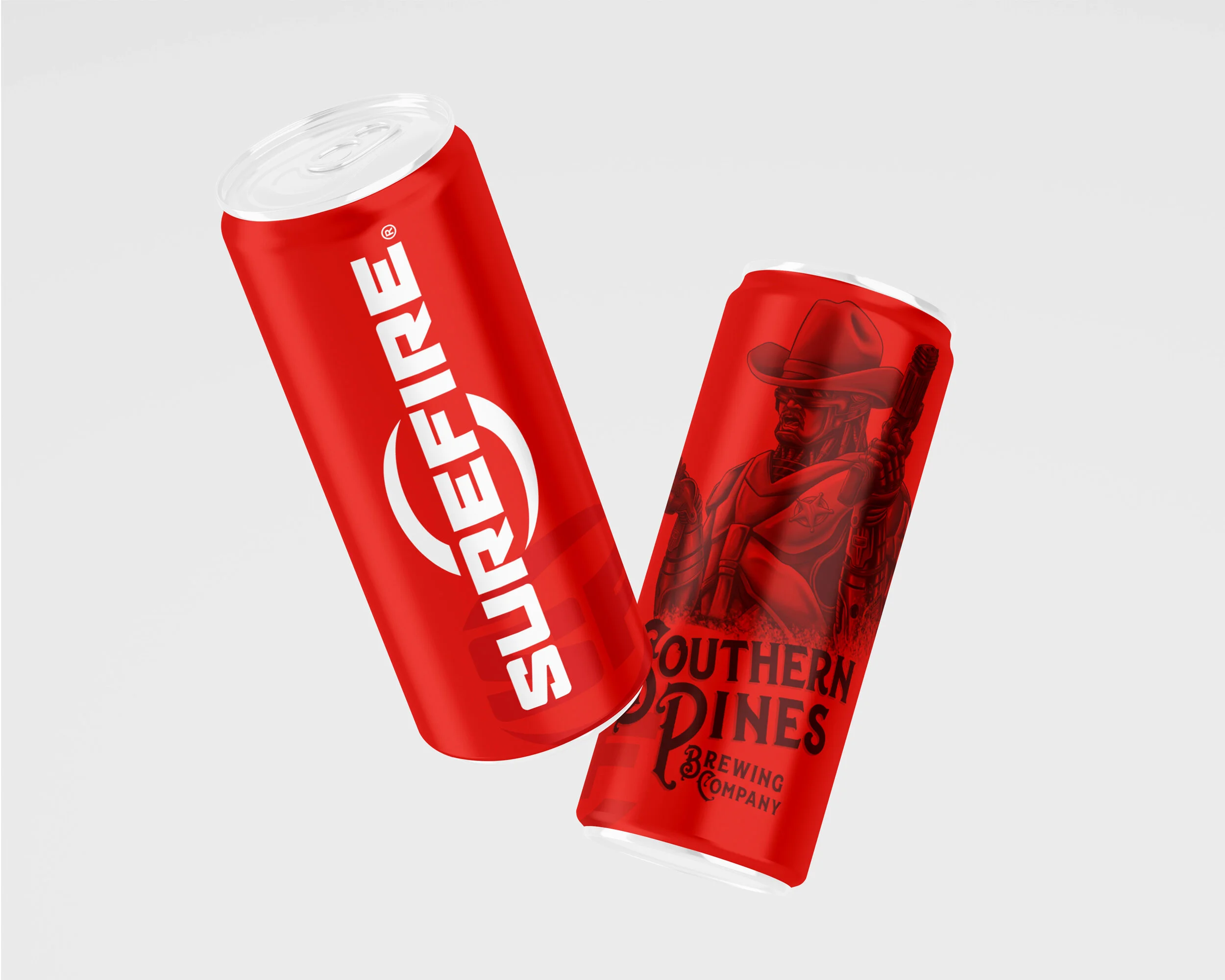
The SureFire identity takes a different form in this red beverage-label presentation, shown from two sides.
06 / Flat packaging artwork
EVERY PANEL.
PART OF THE DESIGN.
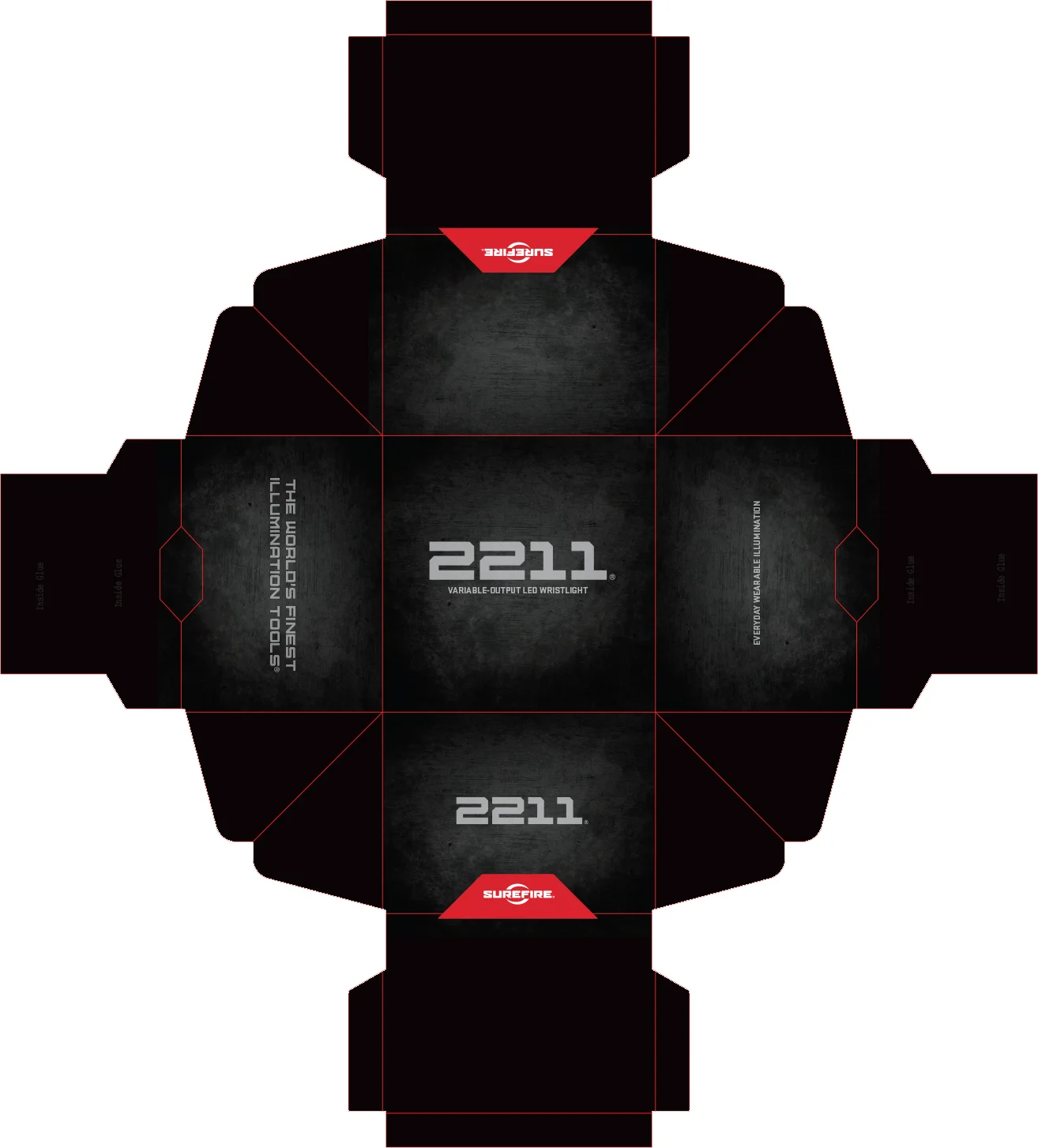
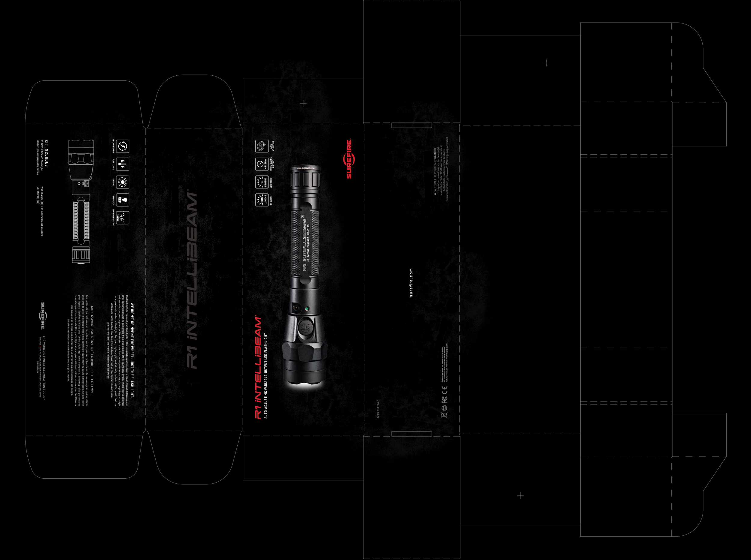
An additional packaging layout shows graphics, product imagery, and information arranged across an unfolded box format.
07 / Frequently asked questions
THE WORK.
THE DETAILS.
Answers about the packaging formats and projects in this collection.
What packaging design work is featured on this page?
The collection includes SureFire Vampire and 2211 Luminox product packaging, Raw Elements labels, Emergen-C carton and packet artwork, a SureFire beer label, and additional flat packaging artwork.
What types of packaging are shown?
The portfolio shows product boxes, circular container labels, beverage labels, cartons, and packets. It includes both dimensional presentations and unfolded panel artwork.
What does the SureFire packaging work include?
The SureFire work includes a Vampire package presentation with lid and base artwork, 2211 Luminox box renderings and panel layouts, and a separate beer-label presentation.
How does packaging design distinguish products within a collection?
In the Raw Elements work shown here, a shared circular label format creates consistency across the collection. Different colors and product names help distinguish the four variants.
How can I discuss a packaging design project with Mako Blue?
Contact Mako Blue with a description of your product, the packaging formats you need, and any existing brand assets or project requirements.
Your next packaging project
GIVE YOUR BRAND
A NEW DIMENSION.
Bring your product and its visual identity together. Let’s talk about the packaging you’re creating.
Let’s talk packaging